This is the logo I have designed in Photoshop (Adobe Photoshop, 2021) for the Woodland Chaos game. I opted for a serif font called Cinzel for the text as it is fairly imposing and indicates that despite the cartoon-style graphics, this game is sophisticated and aimed at an older, more serious gaming audience.
I gave the word ‘WOODLAND’ a gradient of green an blue to reflect nature and to establish the setting of the game, whereas for the word ‘CHAOS’, I have applied a fiery gradient along with a fiery outer glow. I gave both words in the logo contrasting colour schemes as I wanted to emphasise a sense of chaos within the game and that within the game, we initially establish a sense of calm and serenity, but this is disrupted by destruction and devestation.
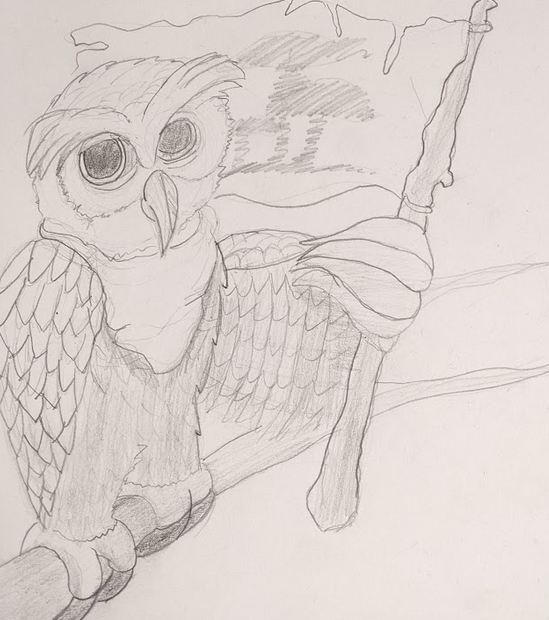
The flag behind the logo is the flag of Progen Forest. I came up with this flag previously in an early piece of concept art I drew for the owl, as seen here.
As a graphic designer, I recognise that for a logo to work, it must still be legible in silhouette form, otherwise the logo does not work. This is important for if you need to print the logo in black and white, such as for letterheads. Here is how the logo looks without the colour.
Next, I am going to start adding this logo to all our promotional material, as well as a main menu design.
References
Adobe. 2021. Adobe Photoshop 2021 (2021). [Software]