I have been designing a logo for our game, which will be visible in the main menu, as well as any promotional/marketing material that we make for the game.
Initially when I began sketching for the design of the logo, I was playing around with a roots motif, and having a logo which has the name of the font, with the roots of a tree or plant around it.
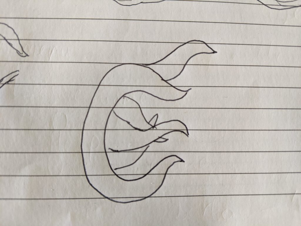
Here are some of my rough sketches.
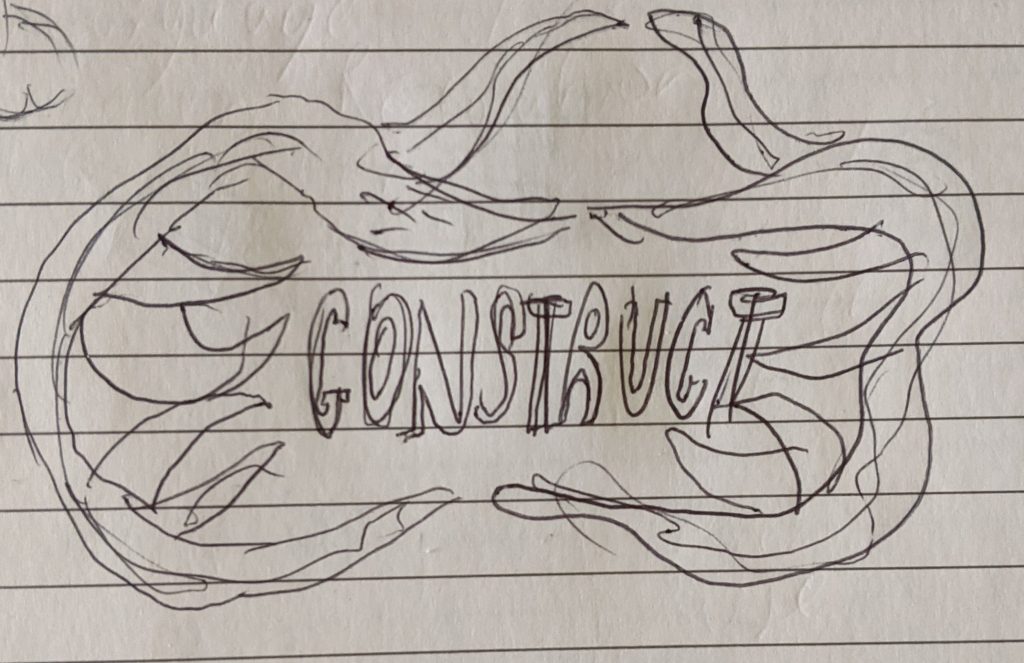
I was initially happy with this drawing, so I decided to bring it into Illustrator (Adobe Illustrator 2021, 2021) and start creating it digitally. To gain inspiration for the colour scheme and texturing of the logo, I also went onto Pinterest to search for numerous examples of game logos (Pinterest, 2021).
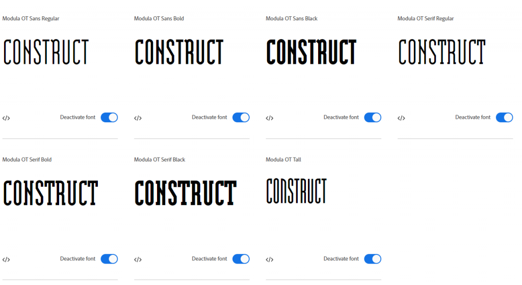
I originally designed the logo with narrow letters that contain a slab serif. I created the graphic in illustrator using an Adobe font to accomodate this called Modula (Fonts.adobe.com. 2021).
The initial rough design of the font looked like this.

For this design, I tried to stick to the in-game colour schemes that we had agreed to. However, this did not work in the logo and the colours actually clashed.
The lettering was also too thin and did not really stand out enough.

I looked at several game logos for inspiration and a lot of game logos have very vibrant contrasting colours and big blocky letters, so I decided to redo the logo design according to this (Tey, J., 2021).
I decided to use these as inspiration and I redid the initial logo. I produced two variations with different lettering, one with a brown border and the other without.
For this revision, I chose a font called Lunatix, which is much wider and worked a lot better.


While it is probably an improvement of the first attempt and the name clearly now stands out, I ran the logo by my team mates on our Discord server (Discord, 2021), but they all stated that the style is perhaps too cartoony for the overall game style that we are going for. They advised me to incorporate the tree of life into the logo more clearly, so I decided to revise the logo completely so that it included the Tree of Life and also hinted at what happens to the Tree of Life during the course of the game.
I decided to do revise the logo again. I decided to retain the Lunatix font for this next revision. I was originally going to have the tree as the backdrop of the logo, but after playing around with it, I decided to make it so that the tree is a full part of the logo and also serves as the first ‘T’ in Construct.
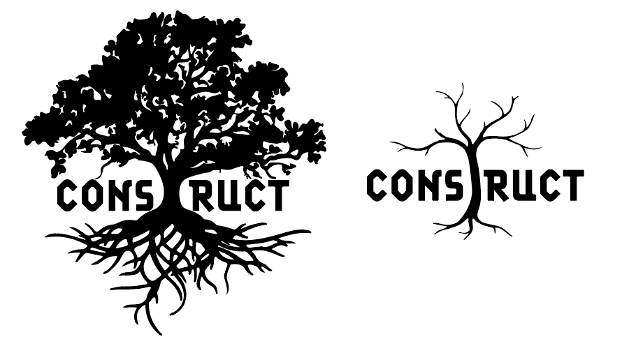
I created these two variations of the logo, one with the tree in full bloom and one with the tree as lifeless with no leaves. An early idea I had was to actually utilise both logos and have it so the first logo gradually comes to resemble the second logo the more the player plays the game, hinting at what is going to happen to the tree of life.
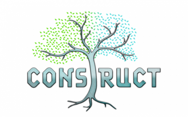
I showed this idea to my team and they really liked the concept although they thought that I should not have a logo that is in full bloom or dead, but rather in between.
To do this, I took the second version of the logo and I modified it to include leaves. They needed to be laid out in a way that makes it seem as though there is life in the tree but that it is not too full. I created these leaves by creating a custom brush that resembled leaves and then I drew using the brush tool.
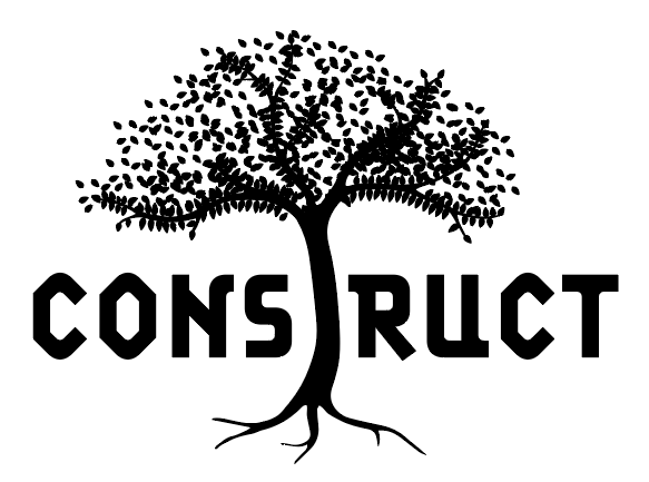
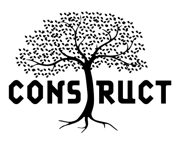
I had to create numerous variations of the leaves in different arrangements until I found the one I was satisfied with. I then had to tidy this up to ensure its not overcrowded and there was no overlap.
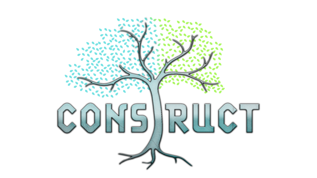
Once I was satisfied with how the logo looked, I took it into Photoshop to texture it (Adobe Illustrator 2021, 2021). The team were looking for a more realistic logo, so I decided to move away from the vibrant colours and gradients that I had used before and instead use more stoney, metallic textures; similar to what you would see in the Age of Empires logo (Age of Empires, 2021).
I created three variations of the logo which had a distinct colour and texture. For each of them, I decided to texture the logo so that the word CONSTRUCT, including the tree that doubles up as the first T, would be one texture and the leaves would be another. This would mean that the Tree of life would have a dominant central place in the logo, but it would also be part of the lettering of the game title.
The leaves had a different texture, which was a simple green/blue gradient, similar to what we have included in the agreed colour schemes for the game. The colour of the leaves can be animated or changed if needed. The leaves can also be removed altogether when necessary.
Here are the different materials I came up with for the logo.

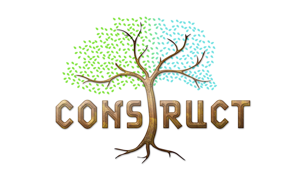

I showed these to the my team members and they particularly liked the third and more metalic texture. A few were not so keen on the bevel effect of the other two.
They also requested a blue tint in the logo, so the final outcome was as follows.
The next stage will be to implement this logo in the game menu, as well as any other promotional material we have.
References
Adobe. 2021. Adobe Illustrator 2021 (2021). [Software]
Adobe. 2021. Adobe Photoshop 2021 (2021). [Software]
2021. Discord. Discord, Inc. [Software]
Age of Empires. 2021. Age of Empires IV – Age of Empires. [online] Available at: <https://www.ageofempires.com/games/age-of-empires-iv/> [Accessed 14 July 2021].
Fonts.adobe.com. 2021. Lunatix | Adobe Fonts. [online] Available at: <https://fonts.adobe.com/fonts/lunatix> [Accessed 11 July 2021].
Fonts.adobe.com. 2021. Modula | Adobe Fonts. [online] Available at: <https://fonts.adobe.com/fonts/modula> [Accessed 9 July 2021].
Tey, J., 2021. Pin by Jamie Tey on Game title | Game font, Game interface, Map games. [online] Pinterest. Available at: <https://www.pinterest.co.uk/pin/29554941290320816/> [Accessed 14 July 2021].
Pinterest. 2021. Game Logos. [online] Available at: <https://www.pinterest.co.uk/search/pins/?q=game logos> [Accessed 11 July 2021].